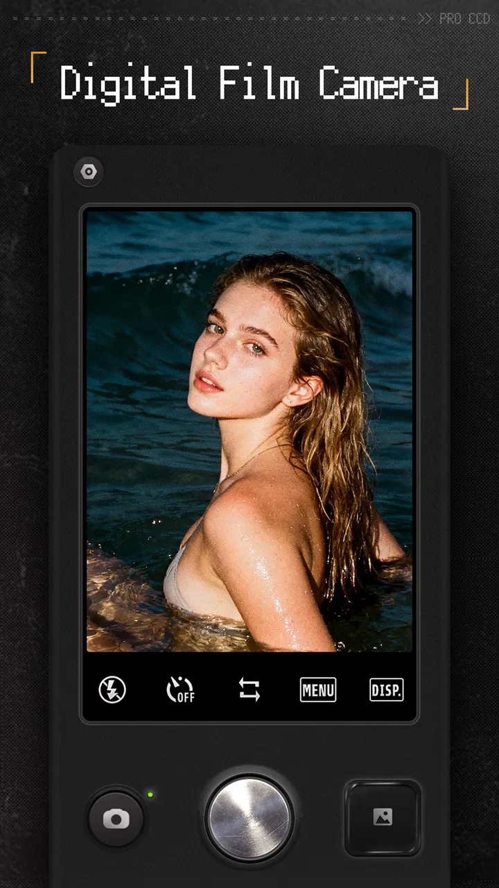
ProCCD - Digital Film Camera
- 4.8
- Rating
- 10.00M
- Installs
- Free
- Price
 Analysis by App-foxy
I opened ProCCD expecting a quick way to give ordinary phone photos a dated-camera feel, but I ended up treating it more like a small visual workflow. The app focuses on analog-inspired looks, Polaroid-style framing, early-digital and Y2K moods, and retro camera effects rather than trying to replace a full professional editor. That distinction matters: it is built to help me choose a visual direction quickly, shoot or edit with that direction in mind, and share something that already feels finished.
It is a free photography app from cerdillac, with optional in-app purchases ranging from $0.29 to $23.99 per item. Its Teen content rating makes it broadly suitable for older children and adults, while the current version is 4.7.0 and works from Android 7.0 onward. The app has reached over 10 million installs and holds a 4.7 average from around 176 thousand ratings, which fits my impression that it is aimed at people who want a recognizable style without spending time building one from scratch.
From a plain phone photo to a deliberate visual idea
I use this section to look at how a chosen visual mood changes the way I approach an ordinary scene, from framing the subject to deciding what belongs in the edges of the shot. That shift is useful even before I apply an effect: it gives me a simple creative brief to follow. Next, I’ll focus on how to carry that idea through a set of images without letting the treatment overwhelm them.
You May Also Like
 Google Keep - Notes and lists
Google Keep’s Quiet Growth Shows the Appeal of Simpler Notes
As mobile work gets busier, Google Keep keeps winning a simple contest: capture a thought quickly, find it later, and get on with the day.

 Blood Strike: 2.5 Anniversary
Blood Strike’s Loadouts Turn Every Drop Into a Tactical Gamble
A close look at Blood Strike’s custom loadouts: how fast access to signature weapons reshapes its battle royale rhythm, rewards preparation, and narrows the gap between fights.

 Pandora - Music & Podcasts
Pandora’s Music Is Easy to Start, but Harder to Recover
Pandora’s strength is its low-effort path from a seed to a station. Its weak spot is how much confidence it asks you to place in connection, setup, and quiet recovery.

 8 Ball Pool
 Is Built on Rivalries, Rematches, and Routine
A close look at the rivalries, rematches, shared routines, and unanswered safety questions that turn a quick pool match into a persistent mobile community.

 Samsung Music
’s Quiet Strength Is Playing What You Already Own
Its reach comes less from spectacle than from dependable access to a personal library. That simplicity is both the app’s strongest retention engine and its ceiling.

 AccuWeather: Weather Radar
AccuWeather Review: A Quick, Clear Forecast for Everyday Decisions
For everyday plans, the best forecast is the one you can understand quickly. AccuWeather makes rain timing, radar, and local conditions easy to act on, with a few trade-offs.
More From Our News Desk



Starting with mood instead of technical settings
The strongest part of the experience is the creative starting point. With a normal camera app, I usually take the photo first and think about the look later. Here, the retro treatment is part of the decision from the beginning. That changes how I frame a scene: harsh sunlight, a convenience-store aisle, a messy desk, or a flash-lit portrait can become part of the intended style instead of a problem to correct afterward.
The collection of visual directions is broad enough to cover several familiar eras. Some treatments suggest disposable or analog film, others lean toward instant-print photography, and the Y2K and old digital-camera influence gives casual snapshots a more deliberately imperfect character. I especially like this when the subject is ordinary. A coffee on a kitchen table does not need dramatic composition if the color, texture, and framing make it feel like a found memory.
That immediacy is useful for creators who are still developing a visual identity. Rather than adjusting exposure, color balance, grain, contrast, and borders separately, I can begin by asking a simpler question: should this image feel warm, faded, glossy, nostalgic, or like an old compact-camera capture? The answer gives the rest of the edit a direction.
Choosing the right look for the subject
The filters are not interchangeable decorations. A soft film treatment can help a portrait feel less clinical, while a stronger digital-era effect may suit a night-out photo, a mirror shot, or a fashion post. Instant-photo framing works well when the image needs to feel like a keepsake, but it can look forced on a clean product image. I found that the best results came from matching the effect to the story rather than picking the most dramatic option.
A useful habit is to preview several styles before committing to the image. I look at the subject’s brightest area, the skin tones if people are present, and any text or small details in the frame. Retro effects often make bright highlights more noticeable and can soften fine detail. That is attractive for atmosphere, but less helpful when the photograph needs to show a product accurately or preserve readable information.
This is one area where ProCCD differs from a standard social-media editor. Those editors often encourage quick decoration through stickers, captions, and broad effect menus. ProCCD feels more focused on the image’s overall camera character. If my goal is a polished promotional graphic with typography and layered design elements, I would rather use a dedicated editor. If my goal is to make a photo look as though it came from another era, this app gets me there with less friction.
Using the camera as part of the concept
The old-camera approach is more interesting when I use it before taking the picture, not only as a rescue tool afterward. I can choose a mood first, then look for scenes that suit it. On a short walk, I might use a faded film direction for architecture and signs, then switch to a more immediate-looking treatment for friends. That makes the outing feel like a small photo project instead of a series of unrelated snapshots.
There is also a practical creative advantage to making the style decision early: I stop overshooting. When I know I want a casual Y2K-like image, I am less tempted to take dozens of technically identical photos and edit them all later. I can concentrate on timing, expression, and framing. For people who publish frequently, that reduction in decision fatigue is more valuable than having endless adjustment controls.
A realistic everyday workflow
Imagine I am preparing a weekend post about a local market. I can photograph the stalls, handwritten signs, food, and friends with a consistent retro direction rather than mixing a clean phone-camera image with unrelated filters afterward. Back at home, I can review the strongest frames, apply a treatment that keeps the set visually connected, and use an instant-photo style for one memorable image. The result is not just a collection of pictures; it has the feeling of a small visual diary.
For a creator making short-form content, the same workflow can support a behind-the-scenes sequence. A rehearsal room, a clothing rack, and a final portrait can share the same visual language. I would still use another app for video editing, captions, or scheduling, but ProCCD can supply the still images that make the finished post feel less generic.
Making, refining, and handing off the finished image
Once I have a direction, the real test is whether it holds up across editing and sharing. I’ll cover a practical way to compare a few candidate images, spot when a retro treatment is costing too much clarity, and keep a clean original available for other uses. Those choices matter most when a photo needs to work both as a personal keepsake and as a polished post.
Editing without losing the original idea
My preferred way to use the app is to make one clear change at a time. I start with the camera or filter direction, inspect the image, and then decide whether the frame needs a lighter treatment. If I immediately stack several strong effects, the photograph can become more about the filter than the subject. The app invites experimentation, but restraint usually produces the more believable result.
One non-obvious benefit is that the retro framing can influence cropping decisions. A Polaroid-like presentation gives the image a different visual balance than a full-screen phone photo. I pay attention to where the subject sits within that space, especially around faces and objects near the edges. A crop that looks fine in a normal gallery can feel cramped once a border or instant-print composition is involved.
I also recommend checking the image at full size before sharing it. Nostalgic treatments can be forgiving when viewed quickly in a feed, but softness, heavy color shifts, or reduced clarity become more obvious when someone opens the image. For a personal post, that may be exactly the charm. For a small business, portfolio piece, or product announcement, I would compare the edited version with the original and choose the one that communicates most clearly.
Where the app is strong during iteration
ProCCD works best when iteration means comparing different visual identities, not performing detailed retouching. I can ask whether the photo feels more convincing as film, an instant print, or an old digital capture. That kind of comparison is quick and creative. It helps me decide what the image wants to be before I spend time polishing it.
For example, a portrait with a busy background may benefit from a treatment that lowers the background’s visual intensity. A street scene with strong signs may need a gentler effect so the lettering remains part of the story. A night photograph may look atmospheric with a digital-camera feel, but a very aggressive treatment can turn shadows into an indistinct block. These are not failures of the app; they are reminders that a preset style always interacts with the source image.
The trade-off is control. Someone who wants precise curves, masks, selective color adjustments, detailed skin retouching, or carefully managed layers will probably outgrow this workflow. ProCCD is a fast style-making tool, not a replacement for a full desktop editor or a comprehensive mobile photo suite. I appreciate that focus, but I would not choose it as my only photography application.
Keeping a consistent series
Consistency is one of the most useful reasons to use the app for creative output. When I am preparing several images for a carousel or a small personal project, I try to keep the treatment family consistent and vary the subject matter instead. That gives the set a coherent identity without making every frame look identical.
A practical approach is to select three or four candidate images first, then test the same visual direction across all of them. A filter that looks excellent on a close portrait may flatten a bright outdoor scene. Testing the group prevents me from finishing one image and discovering later that the rest of the series cannot support the same look. This is a simple step, but it saves time during publishing.
I would also avoid judging a style only on the most attractive frame. Check skin, sky, white objects, and dark areas across the set. Retro effects often have a signature color response, and that signature can either unite a series or make it feel uneven. ProCCD gives me a quick way to explore that relationship, but the final decision still depends on the photographs I bring into it.
Publishing and handoff considerations
For social sharing, the app is convenient because the image can leave the editing stage with a clear visual personality. I do not need to explain that a photo is meant to feel nostalgic; the treatment communicates that immediately. This is particularly helpful for casual creators who want their feed to look intentional without building a complicated preset system.
For a client or brand handoff, I would be more selective. A retro effect can be excellent for a campaign concept, mood board, event recap, or lifestyle post, but it may not be appropriate for every deliverable. If a client needs accurate colors, crisp product detail, or a neutral master image, I would keep the original and provide the stylized version as an additional option. The app is best used as part of that handoff, not as the sole archive of the work.
Before publishing, I check the image in the same context where people will see it: a bright phone screen, a dark interface, or a small feed preview. A subtle effect can disappear in a thumbnail, while a heavy border can dominate it. I also consider whether the image needs a separate crop for different platforms. ProCCD helps create the look, but it does not remove the need to think about presentation.
What may frustrate experienced photographers
The main limitation is the balance between speed and fine control. The app’s appeal comes from recognizable visual treatments, yet that also means the result can feel less personal if I use a popular look without adjusting my approach to the subject. Creators who enjoy building a style from individual parameters may find the preset-led workflow restrictive.
There is another creative risk: nostalgia can become a shortcut. Adding a film-like or Y2K-inspired appearance does not automatically give a photograph meaning. Weak framing remains weak framing, and a busy composition remains busy. I get the best results when I use the effect to reinforce an idea already present in the image rather than hoping it will create the idea for me.
The optional purchases are worth considering if I plan to use the app regularly. The app itself is free, but the presence of item-based purchases means I would explore the available experience before building a workflow around a particular style. For occasional users, the free starting point may be enough to decide whether the visual language suits them. For frequent creators, it is sensible to treat paid effects as a creative budget rather than assuming every look should be available at no cost.
Who should use it, and who should choose something else?
I would recommend ProCCD to someone who wants photos with a clear analog, instant-print, Y2K, or old-digital feeling and does not want to spend several minutes recreating that look manually. It is particularly suitable for personal diaries, travel snapshots, fashion posts, friend-group memories, mood boards, and creators who want a consistent nostalgic thread across their images.
It is also a good fit for beginners who feel overwhelmed by advanced photo editors. The creative decision is easier to understand when it starts with a visual mood. Instead of learning every technical control, I can experiment with the relationship between a subject and a style, then develop better editing judgment through repetition.
I would skip it as a primary tool if I need professional color accuracy, complex retouching, layered compositions, extensive typography, or detailed local adjustments. In those cases, a full-featured photo editor is the better choice. I would also avoid relying on it for every image if my work needs a clean, modern, neutral appearance. Its character is the point, but that character will not suit every brief.
My final view after using it as a creative tool
ProCCD succeeds because it makes style selection feel like part of taking a photograph rather than an intimidating technical stage afterward. I can start with a mood, test it against the subject, refine a small series, and hand off images that already have a recognizable identity. That makes it more useful than a simple novelty filter when I am producing a set of images with a purpose.
At the same time, I would keep expectations realistic. It is not a complete replacement for a serious mobile editor, and its strongest results depend on choosing an effect that respects the original photograph. The app can make a plain moment feel like a memory, but it cannot replace composition, timing, or a good subject.
My recommendation is straightforward: if you enjoy retro photography and want a fast way to make everyday images feel more distinctive, it is worth trying. I would use it as the visual front end of a broader workflow—capture or select the image here, compare a few directions, preserve the original, and use another tool when the project needs precise finishing. For that role, ProCCD is a focused and enjoyable photography companion, especially for creators who value atmosphere more than exhaustive manual control.
FAQs for ProCCD - Digital Film Camera
01What is ProCCD - Digital Film Camera used for?
ProCCD - Digital Film Camera is designed for photography enthusiasts who want to capture images with a vintage film aesthetic. The app simulates the look and feel of classic film cameras, offering a variety of filters and effects that mimic old-school film types, giving your photos a nostalgic touch.
02What features does ProCCD offer to enhance my photos?
ProCCD offers a range of features including multiple film simulations, adjustable film grain, light leaks, and color grading options. Users can also tweak exposure settings, add vignettes, and apply various filters to create unique visual styles that replicate traditional film cameras.
03Is ProCCD suitable for professional photography?
While ProCCD is primarily geared towards creative and recreational photography, its array of features can be useful for professionals seeking a distinct, retro aesthetic. However, it may not replace high-end professional tools but serves as a creative supplement for photographers wanting to experiment with vintage styles.
04Does ProCCD support sharing photos on social media?
Yes, ProCCD makes it easy to share your edited photos directly to social media platforms. The app includes built-in sharing options that allow you to seamlessly post your creations on Instagram, Facebook, and other networks, making it convenient to showcase your vintage-style photography.
05Is ProCCD available for both Android and iOS devices?
Yes, ProCCD - Digital Film Camera is available for download on both Android and iOS platforms. Users can find the app in the Google Play Store for Android devices and the Apple App Store for iOS devices, ensuring accessibility for a wide range of smartphone users.
Pros
- Authentic film-like filters enhance photo quality.
- User-friendly interface for easy navigation.
- Variety of lenses and effects to choose from.
- High-resolution output for professional use.
- Seamlessly integrates with social media sharing.
Cons
- Limited free features; many are premium.
- Occasional app crashes disrupt usage.
- Slow startup time can be frustrating.
- Needs manual adjustment for best results.
- Consumes significant battery during use.

ProCCD - Digital Film Camera
Gallery